My skills / Game Design
Game Design is a recent job. Before, people who designed games used their own recipe and vision. Today, the game designer can be found in all kinds of teams and developments.
Game Design slowly became a set of principles, rules, based on a accumulation of experience. Some companies, like Ubisoft for example, own their game design bible, updating it as often as they develop a new game.
Basically, what is Game Design?
At the heart of this field, the game "experience". Of course, it implies the "fun" (the entertainment value), and the coherence. The game, serious or bizarre, must follow its proper logic clearly understandable by any player. It must offer the comfort in the reading, essential in the actions tracking. The aim is to allow the player to understand clearly the reach of his input and the answer of the game, in a single look, or by other ways (sound, vibrations, etc.).
The comfort is present in the game itself. It's obtained by polishing its tuning: balance. For any kind of games, the player must maximize the gameplay mechanics learned throughout its progress. For example, in a platformer, a fine tuning allows him to obtain a true accuracy in his character moves and actions.
My skills
- Designing the game and writing the Game Concept: Writing original ideas matching to the briefing, the target, etc.
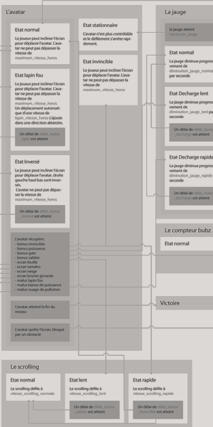
- Defining the game and writing the Game Design Document: Designing the gameplay mechanics, defining behaviours for the whole game entities, writing the complete list of variables concerning the tuning, etc.
- Defining the list of content : graphic assets, sound, music, signs & feedbacks, etc.
- Tuning: 3C (Camera Control Character), ergonomics, prioritization in graphic interfaces, systems, etc.
- Communication: Understanding the team needs, communication with coders and artists, etc.
- Designing creation tools: Set up of solutions in order to create specific content for the game.
Task: Boss fight: Teal'c VS Khufu
11.15.2013Softwares:
Concept
At the begining it was said I had to work on something epic but trying to avoid adding features because of the deadline.
I started to think about a way to design a generic combat. The best way was to use the tap and sliding quick time events and also, because in this part you are fighting a boss I wanted the player to feel it this way.
So I decided to create this kind of patterns a boss can have and added a healthbar on both character to make a comparison and add tense for the player. To sum up the design, the fight uses randomly chosen sequences of QTEs with different ratio. At first, Teal'c will try to hit his opponent. If he succeed, Khufu looses some health, in the other case, the boss just block and try to counterattack, giving the player a last chance to acheive another QTE to save his character from the death.
Anyway, if he is alive, another sequence is chosen. Maybe Khufu will attack Teal'c and the player will have to block or will see the healthbar decreasing. In anoher case, maybe he will have to make several combos. If he fails Teal'c takes one more hit.
A second part
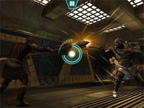 After, I added a second combat part, like an evolution of the boss. When the player reachs the bottom of Khufu's healthbar, the second sequence starts with Teal'c losing his weapon. In this position the boss becomes harder but the sequence is more like a cinematic showing a more epic combat helping the player feeling the tense of it.
Designing the moves
With the help of other colleagues we made some captures of the most important moves to give the most information we can to the animator. After defining more content, we recorded some videos.
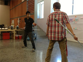
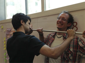
In the first combat, the characters had to go quickly from one move to another if the player succeeds or not.
For the second part, it was something more epic, showing a perfect ending gratifying the player a lot.
Summary
In the last chapter of Stargate: Unleashed, Teal'c is fighting Khufu, a strong opponent.
Work: I designed the boss fight
Task: Concept: Epic Zombie Survivor
08.12.2012Softwares:
 At the same time as my teacher work at Supinfogame, I develop on new technologies I never used before. To do technology watch, I decided to design create little personal projects. By the way, Epic Zombie Survivor was born, a flash game on the theme of the day.
The intention behind Epic Zombie Survivor
The main interest behind this concept is to make the player feel the characteristic frightening of a "survival-horror" in a game conceived as a "Flash" formated one.
Concept and design choices
In order to keep the game unrevealed publicly since the end of the development, please contact me for more information.
The artistic direction and the universe
The game takes place in a american metropolis comparable to New York and its districts: Manhattan, Bronx, Brooklyn, Staten Island. It shows the wounds of zombies invasion; many traces reveal the horror of the scenes taking place in the city streets. We hear the silence now, any sound being able to alert the living deads.
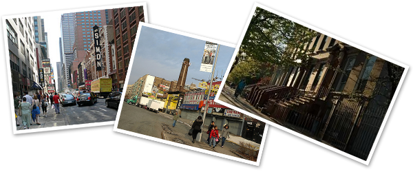
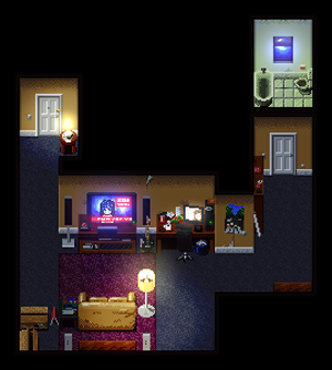 The game orientation is pixel art. This kind of graphic designg allows to symbolize the landscapes and to focus on the murky details. It offers a reading comfort to the player, give an 'independant game' style, and allows younger players to play a survival horror: 12 years and older.
With pixel arts, landscapes are also made of shadows and lights that strengthen the game ambience (doubt feeling, claustrophobia) and generates gameplay (zombies hidden in the dark, game elements teasing...)
To the right, the first landscape in the game:
Development Technology: Flixel
 To prototype EZS (Epic Zombie Survivor), I decided to use "Flixel" flash game engine. Using it is pretty simple, everything is here to create a two-dimensional game: sprite managment, collisions, tile-based levels, path finding, etc. It is optimized for the pixel art and makes game development faster.
Prototype
The prorotype is under construction. To test it or to have more information about it, please contact me.
Summary
This game concept is one of my personal projects. It comes from the common belief that playing a flash game during the spare time disable the feeling of the player. In order to knock this idea, I chose the 'survival-horror' genre that really implies the player in his game. My design is oriented on the feeling, but the game stays a flash one.
Work: Creating the concept and developing the prototype.
Some pictures
Task: Game Design on Pump it!
07.02.2010Softwares:
The first task we had on Pump it was its game design. We started with a game concept with a little prototype and writed the game design document. All these documents are written by our team.
The game concept
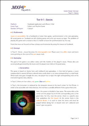
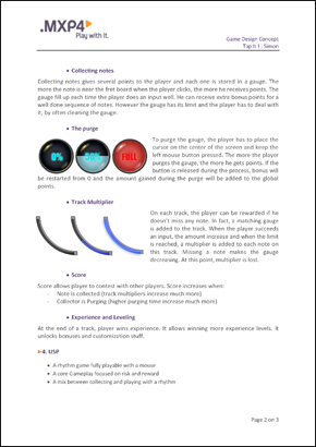
Originally called Simon, like the Ralph Baer's memory game, we changed to pump it during the game design document step.
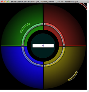
The prototype
For me, when ideas can be implemented easily, it is important to work on some prototypes. Very early, we decided to create a little one to show the game purpose to our direction. Made in ActionScript2 by one of our team members, it was very useful to communicate on the project.
The Game Design document (GDD)
The game design document was mainly used to feed the product backlog. We were in Scrum method so we decided to focus on a document oriented on the customer needs (the MXP4 direction). Unfortunatly, I can't show the GDD on this website.
Summary
In pre-production, we worked together on the Game Design document for the game Pump it!
Work: Writing the Game Design document to get user stories for the Scrum method.
Task: Light/Shadows Rendering
10.05.2009Softwares:
Contre-Jour deals with lights and shadows. The environnement rendering had to be easy to read in order to know in a peek if Charles enchanted shadow is safe or not. I proposed a rendering and tested it with the lead graphic designer during the preproduction.
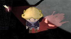
The solution was to have a distinct limit between the safe shadows areas and the dangerous lights. Each part had to be clearly identifiable and display this rendering had to be technically possible with Unity3D 2.6.
- In light: the rendering is realistic, with colored textures.
- In shadow: The shape of the objects are outlined and we can see some patterns inside. We can determine volumes easily thanks to those.
With the lead graphic designer, we created the first objects using the rendering (the pavillon from the video below). We set up the production pipeline for the graphic assets from these.
How does it work?
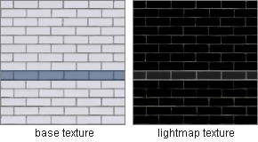
The solution is simple, each object is covered with a material that includes two textures.
- The base texture: It is the first layer of the material. This texture reacts normaly to light.
- The lightmap texture: This is a texture that simulate a light. In the deepest dark, colored pixels reveals the base texture under.
