Task: PUMP IT! Interface V1.0
07.15.2010Softwares:
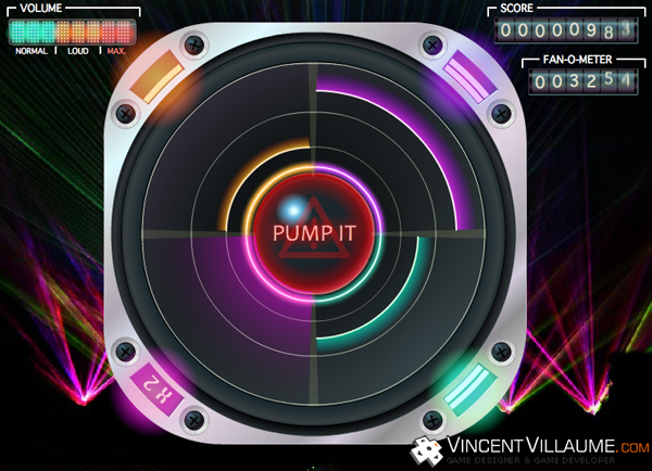
At the same time as the Game Design was progressing, I drew a first sketch of the Pump it! interface.
For this interface, I was inspired by the most played rhythm games on the moment: Guitar Hero, Rock Band.
The videogame we had to make was originally was meant for the David Guetta fanpage, so I dwelled on a design suiting with the musical style of the artist and his audience.
The data to display was:
- The game area with the four quadrants, the pump it button, the tones
- The X2 bonus multipliers on each quadrant
- The score, the fan number: Fans are added to the score at the end of a game
- The volume: the gauge depicting the collected tone number. At its limit, the player clicks on the pump it button at the center, when it's red.
Finally, the interface depicts a speaker with some tones sliding on it. The center is the tone collector point and corresponds to the button to click when the limit of the collector is reached. On each corner, bonus values are clearly identifiable thanks to their glowy design.
Concerning the tone sliding movement, we would think they should move from the center to the exterior because it corresponds to the sound propagation but, on the gameplay side, tones are harder to follow because the sight is on the four corners of the screen at the same time. It sounded better to keep a movement from corners to center.
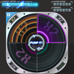
A version 2

Between the first and the second version, we brought in question some gameplay features and readjusted the interface. I changed my job to coder at this time and the graphic designer in our team modified the design.
- The volume gauge was kept for the aesthetic but we had to add a sign to the center where the sight is focused. We put a gauge around the pump it button.
- The button red color was changed for a blue color.
- The multipliers are visible easier thanks to a X2 backgound that appears on each quadrant.
- The 4/3 aspect ratio became a square, we had to adapt.
- We added a pause feature we can trigger with the button on the top and left hand corner.
- Graphic design was refined.


